What will the climate actually be like here in Swaledale in future years?
It’s all very well looking at graphs showing global, or even national predictions of future climate, but do they really tell us much about how it’s going to be right here?
A better question might be: is there somewhere today that has Swaledale’s future climate? Somewhere I could go this year, look around and think ‘ho hum, so this is what to expect’? In other words, can we identify future Swaledale’s climate twin?
The latest official UK Climate Projection data is incredibly detailed, mapping every 5km square of the UK on a monthly, daily, even hourly timescale reaching out to 2080, and covering temperature, rainfall, and windspeed amongst other measures. It’s important to say that this isn’t weather forecasting, it’s modelling and is based on assumptions that might not come true (more on this later), but it is based on the best and latest available climate science.
With this in mind, it is possible to take a point in Swaledale, find its projected climate for a given year in the future, and look for a point elsewhere in the UK that has a very similar climate now. I’ve chosen Isles Bridge as a good point to represent Swaledale in this post.

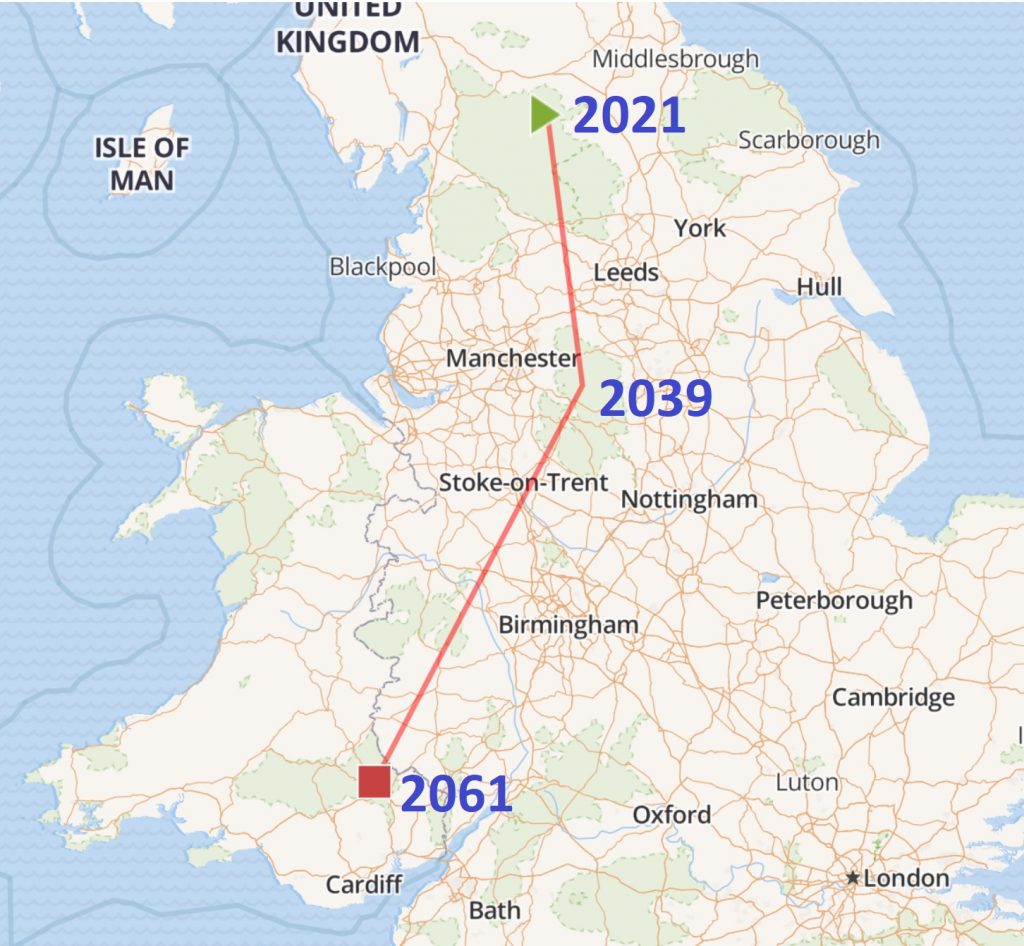
As you can see, Swaledale isn’t staying still! If the modelling is correct then by 2039, we’ll be experiencing the weather typical of Edale in the Peak District, 70 miles to the south. And by 2061, we’ll be in Llanbedr near Crickhowell in the Brecon Beacons, a further 100 miles south.
I hardly need to say that Swaledale isn’t physically on the move, but in a very real sense, Edale’s climate is coming here around 2039, before passing on to make way for Llanbedr’s climate in 2061. With their climate (if they’re able to keep up) will come these regions’ flora and fauna. Visit these places now to travel into our climate future.
In conclusion, Swaledale does have its climate twins. Swaledale 2039 is twinned with Edale (Peak District) 2021, and Swaledale 2061 is twinned with Llanbedr (Brecon Beacons) 2021.
To understand where these conclusions have come from, let’s take a look at some of the detail behind them.
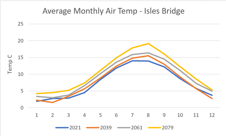
Based on the latest data, the graph below shows the projected average monthly temperature at Isles Bridge for the years 2021, 2039, 2061 and 2079. Note these aren’t based on daily maximum temperatures, they include night time lows and daytime highs, all averaged out. Even though we can reasonably expect some daytime highs in July 2021 to go well into the 20s, the average temperature for this month is projected to be 14 degrees, almost 4 degrees below the projected 2079 average.

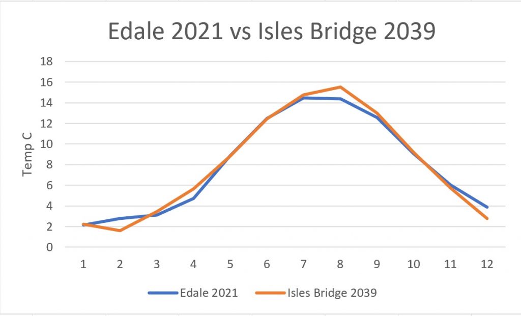
If you then take the projected 2039 monthly data for Isles Bridge, and compare it to each 5km square in the UK for 2021 to find the closest match, you find that Edale is Swaledale’s Climate Twin for 2039. This next graph compares the two.

It’s a pretty close match! Although the projection gives the future Isles Bridge a slightly colder February (is that a Beast from the East in the model?) and a slightly warmer August than the present day Edale, the difference across the year is just one twentieth of a degree.
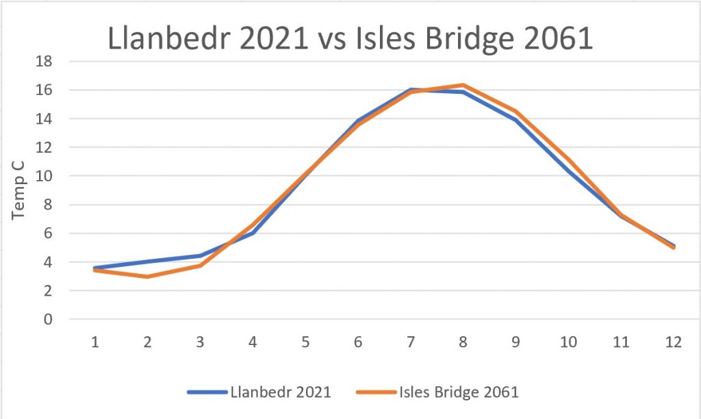
Applying the same approach to the next data set, identifies Llanbedr as Swaledale’s 2061 Climate Twin. Here’s the graph.

Once again, although Swaledale has a slightly cooler February and March and a very slightly warmer autumn, the average over the year is less that one fortieth of a degree. Llanbedr today is an almost perfect match for Swaledale in 2061.
There is more to climate than average temperature. A complete match would need to consider rainfall, windspeed, highs and lows and other factors. Edale and Llanbedr have a similar altitude to Isles Bridge and are good examples of valley locations cut into hill country. They therefore provide a better match than lowland locations that also have similar temperature graphs but would be wildly different in other ways. This is why there is no 2079 twin for Swaledale. Based on temperature alone, there are a couple of spots around Ashford in Kent, and also in northern France that are currently dead ringers for Isles Bridge 2079, but their geography is completely different. By 2079, our climate is off the map.
We can’t be sure exactly how the future will pan out. These official projections are realistic, although if the world hits net zero soon enough, the rate of change may be slower. But we can be pretty certain that it won’t come to a halt: our local climate is already changing and the pace of change will only get faster. Hopefully, adopting our climate twins can make imagining, embracing and preparing for the future a little easier.
What’s behind the data?
Stop reading unless you’re seriously nerdy.
The data used in this post is the UKCP18 local climate projections published by the world-renowned Met Office Hadley Centre, last updated in 2019 to include 2.2km local projections, ‘regridded’ onto 5km squares.
The data are called ‘projections’ rather than forecasts or predictions as they are based on just one of several possible emissions scenarios, in this case, one known as RCP8.5. Climate scientists don’t pretend to understand the social, economic and political factors that will determine future emissions, so instead they feed agreed standard emissions scenarios into their models.
RCP8.5 is sometimes labelled a ‘high emissions’ scenario compared to other standards used. Other emissions scenarios result in a slower or lesser amount of climate change and no one scenario is considered more or less likely than any other, although it would be fair to say that emissions over recent years have tended to be close to ‘worst case’ predictions. Optimists will say that the latest commitments made by China, US, EU and others should lead to a lower emissions future. Pessimists will point out that the more we learn about positive feedback effects on the climate, the worse things look. The UKCP18 data for local area analysis is only available based on RCP8.5, so no choice amongst emissions scenarios was made for this post – RCP8.5 was the only data set in town.
The UKCP18 data is based on feeding RCP8.5 emissions data into twenty of the world’s leading climate models, and then publishing the twelve most representative data sets from those twenty. No weighting or preference is given to any of these data sets, so the data used for this post was created by taking the average across the twelve published sets of data.
The twin matching process is performed by taking the monthly figures for each 5km square in 2021, and performing a ‘sum of the squares of the differences’ calculation to compare them to the monthly figures for Isles Bridge for the year in question. The 5km square with the lowest sum is considered the best match.
More information in UKCP data is available here: https://www.metoffice.gov.uk/research/approach/collaboration/ukcp/index